Creating an Adaptive Card Template
This page describes how to create a custom Adaptive Card Template for your TWA Automation custom scenario. Once configured in Azure Storage, TWA Automation will use the template to create an Adaptive Card which can be sent to either Outlook or a Teams chat depending on your set up.
This guide will briefly explain what an Adaptive Card Template is and how to create one. In order to make the process creating a template easier We have made a example template which contains multiple example components, which you can copy in to your template.
What is an Adaptive Card?
An Adaptive Card is way of displaying and formatting custom content inside of larger client, such as Teams, Outlook, Skype, Cortana and Web Chat. What makes Adaptive Cards different to most markup languages is how the data is styled so it looks and feels like the host client. This means that an Adaptive Card displayed in Teams will look and feel like native Teams content, when the same card is displayed in Skype, it will look like native Skype content.
For a more in depth explanation af Adaptive Cards you can visit the Microsoft’s Adaptive Card Documentation.
What is an Adaptive Card Template?
The Adaptive Card JSON payload that gets sent to a client contains the data to be displayed, and information about how to format, style and display that content. Adaptive Card Templates enables the separation of the data from from the layout. The means that we can create a template, that will define what information should be displayed and how it will arranged. The TWA Automation Bot will then populate the template with dynamic content, before it gets sent to Teams.
Microsoft have created a template language which defines how the data is bound to the layout, it includes loops and conditional expressions. This language is used wherever we want to display data in our adaptive card.
Limitations
The Adaptive Card template schema is constantly being improved and new card elements are being added. However, not all of the latest features can be used in cards sent by TWA Automation. Taking the above into account the unified template, used by TWA Automation, supports Adaptive Cards version 1.4 only.
When creating a new Adaptive Card template you should check that the properties you are using are included in the version 1.4 Adaptive Cards schema.
The TWA Automation Example Template only uses features included in Adaptive Cards schema 1.4, as it is intended to be sent to Teams and Outlook, and is therefore fully supported by TWA Automation.
Adaptive Card Designer
Microsoft’s Adaptive Cards designer is very useful for visualising and validating your card before it sent by TWA Automation. This document will briefly explain the section of the designer and a few useful features.
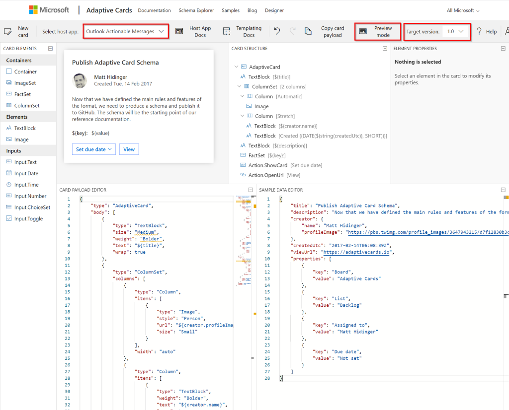
The panel in the top left displays the card you are currently building. The Preview Mode button in the toolbar toggles between Design mode and Preview mode. Design mode displays the card template and its binding to the data, you can also select an element in the Card Structure panel and it’s properties will be displayed in the top right. Preview mode combines the template JSON (in the bottom left) and the data JSON (in the bottom right) to show how the card will look once it has been sent.
The Select host app dropdown shows how the card will look rendered inside different host apps. When creating card templates for TWA Automation you should check what the card look like in the following host apps:
- Outlook Actionable Messages (Outlook)
- Microsoft Teams – Dark
- Microsoft Teams – Light
The Target version button on the right of the toolbar, changes what elements are available dependant on the selected version. A warning is also displayed is you are using elements which are not supported for the current version. You should therefore ensure the Target version is set to 1.0 for TWA Automation cards as explained previously.
Changing the host app, changes the target version, so make sure you check the target version after changing the host app.
The left panel contains a toolbox of card elements, these can be dragged and dropped onto the design in the top left. So there is no way of submitting the input values once a user has populated them. So it’s best to avoid all Input elements for use with TWA Automation.
Example Template
To make it easier to create new templates, development have created an example template which consists of many examples of components that can be copied into your new template. When sent to Teams the template looks like this. The example template contains the following components:
- Card header with logo and scenario name.
- Section headers which can contain static text or be bound to data.
- Table which contains bound data. The example shows 3 columns you should avoid using more than that, as width can be an issue on smaller devices.
- Paragraphs of text with markdown formatting for emphasis
- Embedded links which open new browser windows
- Count comparison with change which shows a comparison/ratio of 2 counts in the middle, and the change over time of those values on the outside. The change data can be omitted if not available.
- Dynamic lists written using markdown formatting
- Static lists
- Count comparison similar to the other count comparison, but with icons. The background colour is required as black icons cannot be screen in Teams dark theme.
- Fact sets can be displayed once or repeated according to data.
- Table containing links, total and change links contain bound data, the total displays a value from data rather than being calculated in the template.
- Image
- Inline change
- Action buttons these behave like links, but as displayed differently. They have to be at the bottom of the back and are styled/aligned according to the host.
Create new template for TWA Automation
Follow these steps to create a new custom template:
Copy the example template
- Open Microsoft’s Adaptive Cards designer
- Copy the example template JSON from the linked file and paste into the CARD PAYLOAD EDITOR panel in the bottom left.
- Copy the example template data JSON from the linked file and paste into the SAMPLE DATA EDITOR panel in the bottom right.
- Change the host to be one of the 3 supported by TWA Automation and select target version 1.0.
- The example template will now be displayed in the top left panel, it should look like this.
When viewing the example template in the designer you may see some Parse warnings. The designer displays these when a TextBlock colour is set conditionally. Conditional colours however are supported, so you can ignore those particular warnings.
Customise the example template
- Componenets – You should go through the template and delete sections or components that are not required for your template. This is easiest done in design mode, by clicking on the section, and pressing the displayed delete icon. You can copy and repeat sections by copying the pasting the relevant template JSON. New elements can also be added by dragging and dropping them from the toolbox on the left.
- Data – Update the contents of the SAMPLE DATA EDITOR to match the data returned by the stored procedure for your scenario. See below for more detail.
- Data binding – Update the data binding within components to point to your sample data, rather than the supplied example. You can either update the JSON directly, or by selecting the element in the designer and changing the relevant property. You should only need to change the field names within the bindings. For more information refer to the Microsoft documentation
- Static text – Update static text, by either updating the JSON directly, or by selecting the element in the designer and changing the Text property.
- Icons/Images – Update the url property of Image elements with the relevant url. Modality has a publicly accessible library of icons available, see here for details.
TWA Automation creates the data for your scenario based on the data returned by the stored procedure for that scenario. The data in the SAMPLE DATA EDITOR should contain and example the data generated by TWA Automation.
TWA Automation generates data in the following format:
{
  "RowsWithAdditionalProperties":[
      {
          "Value":{
              "Field1":"Lorem ipsum dolor sit",
              "Field2":2,
              "Field3":47,
              "Field4":36,
              "Field5":"Lorem ipsum, Dolor sit, Amet consectetur, Adipiscing elit, Praesent",
              "Field6":"Dolor sit, Amet consectetur, Adipiscing elit, Praesent",
              "Field7":"Amet consectetur, Adipiscing elit",
              "Field8":"62%"
          }
      },
      {
          "Value":{
              "Field1":"Maecenas tincidunt",
              "Field2":9,
              "Field3":21,
              "Field4":-39,
              "Field5": "Amet consectetur",
              "Field6": "Lorem ipsum, Dolor sit, Amet consectetur, Adipiscing elit, Praesent",
              "Field7": "",
              "Field8": "0%"
          }
      }
  ]
}
The Value sections are repeated, one for each row returned by the stored procedure, and the Field properties match the columns returned. The number of fields, the field names and field types must be the same in each value section.
Linking to Microsoft Teams content in an Adaptive Card
You can link to teams and channels inside an adaptive card by following Microsoft’s guidance around Teams deep links – links will always open in a browser first and redirect back to Teams. You will need configure the automation stored procedure to ensure you have all the fields which are required for your link. An example for linking to a team is (with TeamId and GeneralChannelId as template variables);
Click [Here](https://teams.microsoft.com/l/team/${GeneralChannelId}/conversations?groupId${TeamId}) to go to the teamWhich will render as “Click Here to go to the team” in the card where “Here” is the clickable link to the team.
Adding custom webhook Urls to Card Actions
You can customise a Cards Action button to trigger a http uri request of your choosing, this can be configured with either an Action.Submit or the newer Action.Execute. In addition, when using Action.Execute, you can also provide a custom card template to be used to replace the exisiting card when an action is successful. You can also configure a failure message for when it is not successful.
WebhookUrls need to be configured in the “WebhooksUrl” table in the Azure Table Storage store. The table has the following columns:
- PartitionKey – this is the tenant id
- RowKey – A unique GUID identifier, that is refered to as the webhookUrlId. This identifier should be included in the declaration of the button in the adaptive card, more detail below.
- Url – The webhook url to be called when the button is pressed.
You can generate unique GUIDs by visiting GuidGenerator and pressing ‘Generate some GUIDs!’. You can then copy the output value and use it as the webhookUulId.
Though please note that only the newer Action.Execute method will use the successful card, however both will use the failure message.
The failure message also has a 64 character limit, anything more than this and the message displaying on the Action.Execute card will be clipped to fit with an ellipses.
Due to a Microsoft limitation, when using an Action.Submit button a ‘Success’ notification is displayed even if the webhook fails. This is a limitation of the bot framework. In this situation, the bot returns an additional error message, but the success notification is still present. This is not an issue when using the newer and recommended Action.Execute
To configure a card correctly you will need to add the webhookUriId to the data property of that action. You can also pass in custom data params inside that data property which we will include in the body of the uri post request. This can be data from forms in the card which can be automatically added to the data. Or you can pre-configure more fields in the template. You do not need to add in your Tenant Id to the data unless you want that passed to your http request, as the modality bot takes your Tenant Id from the Teams Message.
The example shown below is what a correctly configured Action.Submit looks like.
 ...
"actions": [
    ...
        {
            "type": "Action.Submit",
            "title": "Submit",
            "data": {
                "webhookUrlId": "343cc57b-0b44-4b51-8587-cf544b22b1a8",
                "additionalData":  "Lorem Ipsum.",
                "additionalCustomData": "${Value.CustomField}"
            }
        },
    ...
    ]
 ...
`
The example shown below is what a correctly configured Action.Execute looks like.
Because the execute action was built in way that lets developers create multiple different functions, a verb is used to describe the type of action. Without this the Modality Bot Service will not know what to do with this action.
 ...
"actions": [
    ...
        {
            "type": "Action.Execute",
            "title": "Execute",
            "verb": "webhook",
            "data": {
                "webhookUrlId": "343cc57b-0b44-4b51-8587-cf544b22b1a8",
                "additionalData":  "Lorem Ipsum.",
                "additionalCustomData": "${Value.CustomField}"
            }
        },
    ...
    ]
 ...
`
When a user clicks these actions the Modality Bot Service will match this webhookUrlId as well as your Tenant Id with the values previously stored in Table Storage. If the provided values match, the Url for that row will be called and anything inside the data property object will be sent in the body of the request as json. For more information on creating a webhook via Logic Apps, see here.
Further customisation
When creating a template you don’t have to only use controls from the example template, you can create your own layouts and designs, but it’s advisable for continuity, to make them similar in style to the suggestions. For further inspiration browse Microsoft’s Samples and Templates.